Saturday, December 8, 2012

In My Kitchen


As stated elsewhere, the above is not my kitchen (I just like it). And to all my faithful design enthusiasts, don't worry, this hasn't turned into a food blog. Truth be told ALL of this is about lifestyle or living. We design our homes to live in them, to use them. So it's all connected really. Now that I've over-justified this food post, I'll get to it. I've had a recent burst of culinary energy this Holiday season and I've been auditioning, if you will, desserts to bring to the family Christmas dinner. Maybe you'll see one you like, if so, consider it an early Christmas present.   :)


There are 3 contestants as follows:

Banoffee Pie (Banana Toffee Pie)

The Result: It's not the prettiest, but it sure was easy, and ABSOLUTELY delicious. I don't know how wrong you could really go with graham crackers, bananas, toffee, whipped cream, and chocolate anyway.
 
What I'd Change: I'd let it set in the freezer so it's prettier once sliced into, and I'd add the magic shell chocolate after the pie has been frozen so it won't weigh down the whipped cream.


Traditional Bread Pudding


The Result: This required more steps than the other two, and wasn't as fool-proof, but it was yummy too. The pudding was good but it wasn't rich like you might want your dessert to be. It could've easily doubled as breakfast and that wasn't what I was going for. But I would definitely make it again.
 
What I'd Change: I'd make a different sauce. This one was too thick and too mild. Maybe a caramel or something with acid like lemon possibly. And I'd use a deeper pan for the pudding because I like them on the thicker side.


Pineapple Angel Food Cake

The Result: This one was the easiest to make. It took all of 10 minutes, if not less (that doesn't include baking time). If you want something really light, this could be an option. But it was kind of dry. It tasted okay. It wasn't offensive, but there wasn't really a wow factor. If served with Cool Whip or Ice Cream the dryness is alleviated.

 
What I'd Change: I'd probably make a traditional Pineapple Upside Down Cake.
 
 
Well there you have it. The results are in and the judges have made their decision...Drumroll please...The Winner Is
 
The Banoffee Pie!!! Easy and Delish.

Follow the link or visit BrooklynLimestone.com for EASY, step by step instructions for this heavenly pie.

Friday, November 30, 2012

Hello all my DESIGN ENTHUSIASTS!!!! When you need your design fix, please do visit us on FACEBOOK!! We have a great forum and there are many posts open for discussion. COME ON BY!!! 
 
Peace and Love seats    ~M. Daniels

Tuesday, November 6, 2012

Election Day!!!

VOTE, VOTE, VOTE...TODAY!!!!
 
DESIGN ETC. wants to send a special THANK YOU to all the volunteers working the polls today. We appreciate your hard work and dedication.

Sunday, November 4, 2012

Hooty Hoo!


Festive parties are always fun, but when the Fall holiday season rolls around, so do the same old decorations. Leave the oranges, reds, and yellows for the trees ("leave" get it? lol). Switch up your holiday table scape with something unexpected. Whether its Thanksgiving day or a simple dinner party for friends, have fun with different ways to adorn your table. The selections in the above collage picture a few fun suggestions . Feel free to recreate it or let it inspire you to put your own creative spin on your table scape. For now, let's take a look at those items up close.


Chevron Place mat in black/gold. A nice graphic backdrop for your place setting...And totally unexpected.


L.I. Cheese Pumpkins. Run these down the center of your table or group them for a nice arrangement. Their beige color is welcomed departure from the usual orange, and you can certainly cook (here is one idea) with them days after your gathering is over. 
 
 
Here is a sneak peek


These Owl Dinner Plates are a fun way to change things up a bit. Definitely a conversation piece and a sure way to ensure your guest won't forget your party.


What better or more elegant way to present your Owl plates than on a Silver Tree Stump-esque charger?! Provides great contrast from the other elements. 


These Chevron Mosaic Hurricanes add that bit of sparkle and ambiance that every dinner party needs.


Sunday, October 28, 2012

Sunday Obsession...

 
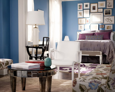
Remember Carrie Bradshaw's Upper East Side apartment? Well, somehow, it became my Sunday obsession. From the floorplan to the ultimate makeover (as seen in the movie), it's been about the fictional writer's fictional four-story walk-up all day. Since Carrie's pre-makeover apartment furnishings were mostly mix and match thrift store finds, I recreated the movie makeover for all you chicas who have Blahnik taste on a freelance writer's budget, like Carrie:) So here we go!


Behr Paint in Babbling Brook


Glass Exquisite Table Lamps


Mirrored Accent Table


Lilac Duvet Set


Laura Hill Jungle Art Pillow


Traks Square Decorative Pillow


And here are some BONUS pieces JUST FOR FUN...


Saturday, October 20, 2012

Love Affair!


Lavender... I remember the very first time I met Lavender. I have no idea why the experience of discovering this color is such a vivid memory for me. It was my 6th birthday and my mother ordered my birthday cake from the bakery. When she opened the box, it was the prettiest purple I had never seen! I asked her, "What color is that?" , and she replied, "Lavender."
 
In hindsight and even now, I can see why I was so enamoured with it. It's pretty, it's mysterious, it's stunning, and it's unique. Every time I see lavender I re-live that experience all over again! And there you have it, my love affair with lavender.
 
As for the picture up there, it just makes me happy. The color is part of the reason, but the interpretation of it makes it that much better. The Shoes? Christian Louboutin Greissimo. The treats? Scrumptious Cake (Courtesy of: Life as a Wife and Twice the Spice - Recipe). The room? No idea who designed it, but let's recreate the look!


Victoria Sleigh Bed from Z Gallerie


Chenille Throw from Target
Vintage Purple Puff Pillow from Amazon.com

Threshold Velvet Decorative Pillow from Target. You can add inexpensive
organza ribbon to the edges to achieve that romantic detail as pictured in the original.


Michelle White Table Lamp from Lamps Plus


Wooster Table from Zara Home


Alice wallpaper from Home Wallpaper Shop

*This piece is a reproduction of an original by artist C. Jere., so it has a higher price point. This is available at Jonathan Adler.


Sunday, October 14, 2012

Total Recall

When it comes to design, there is nothing I love more than walking through and experiencing a space with a concept. Don't get me wrong, it's nice if the space is simply well done but there is something about discovering the intent behind various design choices that is so exciting. The key to carrying a concept through spaces is the "tie-in." For instance, when the outside surroundings are tied into the architecture and then carried through the interiors and ultimately down to the decoration. What do I mean? Well, I can show you better than I can tell you. Now the following photos are not from the same project. However, I did enjoy these projects separately and they reminded me of each other, which led me to thinking about concepts and so on. So here it goes.


CONCEPT= COMMUNITY USING THE SYMBOLISM OF A QUILT
 

MURAL WITH PATCHWORK CONFIGURATION. EVOCATIVE OF A QUILT.
This mural by Bay Area artist Barry McGee cloaks the facade of the Mark Morris Dance Center in Brooklyn. It's vibrant, it's graphic, it's refreshing (to say the least).


COLORS AND GRAPHIC PATTERN FOLLOWED THROUGH TO INTERIOR (PS: I LOVE THAT THE ACTUAL COMFORTER ISN'T A QUILT BUT DEFINITELY REMINISCENT OF ONE. AND GREAT THAT THE RUG IS LIKE PATCHWORK. BOTH ELEMENTS DRAW ON THE QUILT CONCEPT WITHOUT BEING TOO LITERAL).
This space was designed by ColorTHEORY in Boston for their Bay Village Project. The room is fun, colorful, and clever; especially that bookshelf.
 
 
THE QUILT CONCEPT CAN BE SEEN HERE IN A MUCH MORE ABSTRACT INTERPRETATION...THE MIXING AND MATCHING OF THE CHAIRS!  (NOTE: IT'S ALWAYS GOOD TO REINTERPRET THE CONCEPT SO IT REMAINS INTERESTING AND UNEXPECTED) ColorTHEORY, Bay Village project. Organization can be fun! Playtime is over and everything has its place (a parent's dream). And I totally dig the chalkboard paint...AND nice touch framing it with an outline.
 
 
(**Please note: As stated previously, the mural by Barry McGee and the ColorTHEORY projects are not related and do not exist in the same structure. The comparison was strictly for the purpose of this article. So don't go spreading any rumors! LOL**)


We aren't always afforded the opportunity to develop a concept that can be implemented from scratch, but even if you are working with existing architecture, you can let it inform you as to how to approach your interior. If the architecture is leaving much to be desired you can just as easily develop a concept to carry through your interior spaces. However, regardless of how cool or unique a concept may seem, the most important factor is that in some way shape or form it is a reflection of you, your personality, or some other aspect of your life. Otherwise, over time it won't resonate with you and you'll end up living in a really cool art installation. No bueno! Be clever, be true, be  you, always.


Content: Design Concept, Conceptual Design, Barry McGee, ColorTheory Boston, Mural, Quilt
 

Saturday, September 29, 2012

Eclectic Collage


Gallery Wall Collage by Incorporated NYC [Sixteen Doors]


When I saw this eclectic collage I was so taken by it. I didn't know what to look at first (in a good way).  There are so many interesting elements that I couldn't decide which I wanted to study first. It's a great conversation starter and it's clear that there is a story behind each piece.  Personal touches like these are what make a home just that, home. Executing this in your space doesn't have to be complicated or expensive.  
 
 
L.A. actress Andree Vermeulen created a funky eclectic mix like this in her apartment with pictures, posters, and the like, of memorabilia that tell the story of her theatre journey. She admits that it was part decoration and part necessity (to keep her props intact in between shows), but the effect is the same, interesting and eclectic representations of her personality.


The portraits (by Erin McGathy) and boomboxes made from electrical tape are active props, but they add such interest to this theatrical presentation.  The backstage pictures (photography: Robyn Von Swank) and posters have that warm familial effect, featuring her theatre family. Most of the frames used were less than $20 and in most cases under $10; all sourced from  stores like Bed Bath & Beyond and Walgreens. Bravo Andree!


This poster is from Andree's current show "Lula and Lola Are In Big Time Trouble", which is running at UCB LA.  For show schedules and other information: http://losangeles.ucbtheatre.com/shows/view/3191
 
To Follow Andree on Twitter: @DreeAndree


How to do your own collage:
 
First, start with things and pictures that mean something to you. You can stick to something thematic which might help you edit what and what not to use, but you don't have to.
 
Second, is variety, elements with different shapes and sizes. Maybe start off with various sizes of the same shape (small, medium, and large). 
 
Third, is arrangement. Map out how you want to arrange your collage by laying it out on the floor. Once your satisfied, take a picture with your digital camera or even your phone, so you have a reference. Then recreate it on your wall.
 
Fourth, invite people over to see what a great job you've done (this step is encouraged but not mandatory). 


Content: #EclecticCollage, #Photography, #Theatre, #Actress, #InteriorDesign


Sunday, September 23, 2012

Hit Refresh!

Curtains: Wayfair.com, Chair & Pillows: Homedecorators.com, Lamp: Lightunguniverse.com


Sometimes re-doing an entire space just isn't feasible for any number of reasons. Instead of a room re-do, try doing a refresh! Update or change out accessories, artwork, window treatments, and maybe even an accent piece or two. You'd be surprised at what a difference a few small changes can make.
 

Here is a basic recipe for a room refresh:
 
1. Paint: Paint changes a room instantly. Sometimes this is all you need. But for the biggest bang, it helps to make additional changes (I'm getting to it :)
 
2. Window Treatments: Layering is key. Paint offset by curtains or blinds puts you well on the road to maximum design impact.
 
3. Decorative Pillows: Using pillows is a fun way to play with design trends, or seasonal changes like holidays, or simply update the look of your space. Mix patterns and textures, but try to keep a common theme (like shape or color for example).
 
4. Lamps: Lighting makes a space, but a good looking piece makes it that much better. New table or floor lamps add yet another dimension that visually enhances your room.
 
5. Artwork: Depending on your budget, this step isn't necessary, but if you can afford to do it, do it! Like I said before, layering is key. The more layers that pull your look together, the better (within reason of course).  
 
6. Accent Piece: Whether you are switching out a coffee table, a love seat, or just adding an accent chair, the addition of a new piece will serve your space well. This step isn't necessary either, but if you can swing it, certainly do it. You won't regret it.
 
And VOILA!!! There is your room refresh. Happy decorating.


Content: #Room Makeover, #Before and After, #Affordable Design, #Decorating Tips, #NYC Designer, #Interior Design, #DIY
 

Saturday, September 15, 2012

Outta Space...

One might think "the bigger the better" when it comes to living spaces but I don't feel that way. Sure big expanses of real estate are nice to look at.  Quite frankly, I prefer the charm of smaller spaces. The practical side of me is drawn to studios because they have the bare necessities, sleep/eat/"go" areas and there isn't a lot of space to maintain. If well laid out and put together, I'd take a studio over a mansion any day.

Here are a few studios that show that great planning and intention can make a grand statement.


Crisp, white, and well appointed.


Fun and Fresh!


Warm, quaint, and Oh so cozy.

Sunday, September 9, 2012

Dream a little dream...

Every now and then I post a picture of a space that I wouldn't mind having in my own home. This would be one!