Monday, July 25, 2011

Sittin' Pretty

I know it's HOT outside and the last thing you want to do is sit in the blazing sun, however I might be tempted to spend some time in the yard or on the patio if these pieces were there to greet me. We have Cheryl Maeder Antonio  over at  Gardenhouse to thank for these wonderful existing pieces that she refinishes with modern sensibilities.  The result? Vintage with a modern twist; the best of both worlds! They're fresh, fun, and cheery.  Just makes me want to put on a sundress, grab my favorite design mag with a tall glass of lemonade and lounge outside.


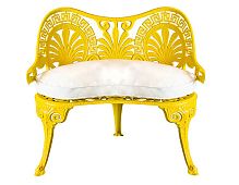
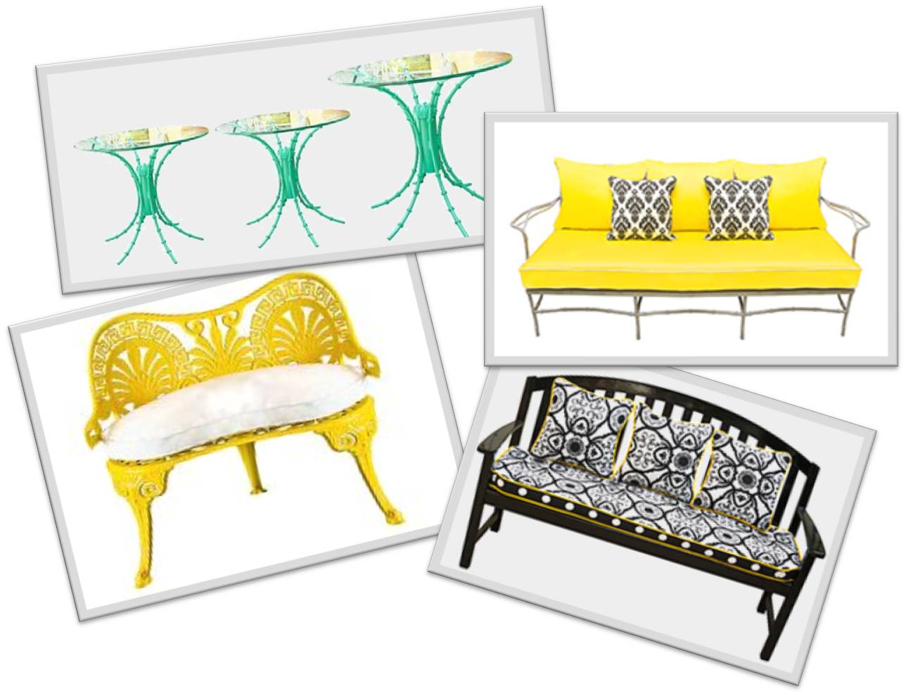
Vintage Yellow Aluminum Love Seat- This is so charming! One of my favorites from the bunch. And you can't help but smile from ear to ear at that Sunshine Yellow paint!


Outdoor/Indoor High Gloss Black Teak Bench- The frame is pretty straight-forward. It's the pillows and the cushions that make this piece pop and that cheery yellow welt makes it that much more playful.


Iron Turquoise Glass Top Tables in High Gloss Finish-  Talk about eye candy! The color is equally as yummy as the intricately detailed pedestal. These tables are really great!!


Outdoor/Indoor Aluminum Sofa- The ironwork on this piece is what I find impressive. It's very delicate but if you look closely you can see the fine details. Simple goes a long way here.

Friday, July 22, 2011

Wake Up and Smell the Flowers...


Summertime is here and the Spring flowers have already bloomed! Well if you're like me flowers don't really stand a chance in your home. So for those of you who are missing that floral presence, here are a few items that will bring that floral feeling back into your life, and the best part is you don't have to water them! 


Sanderson Primavera Wallpaper in Chaffinch- Isn't this fun and funky! I can see it in a small foyer with a great mirror and console table! Great color combo too. I really like her.
Moooi Naval Brass Table by Marcel Wanders- This is a wonderful little side table. It reminds me of a silhouette. Love the positive negative space of the table's surface.
Hida Collection Como Round Bowl by Enzo Mari- This is a cool sculptural piece. I guess you could use it as a bowl too, but why would you? Let it be.

The Art of The Flower- A lovely alternative to a vase of flowers on your coffee table. Thumb through this puppy for great floral still life arrangements.


Gandia Blasco Modern Flower Rug- This chic rug adorn with  seemingly stamped daisies makes a nice graphic pattern and a bold statement.

Boco Do Lobo Liberty Mirror- I know it looks a little too sweet but use it in an edgy unconventional way and you might not even notice the flower reference.


Monday, July 18, 2011

Your Favorite Team? A Subtle Theme


Many of  us have favorite sport's teams. But only few of us go as far as incorporating our team into our home decor.  And often when people do, it ends up looking like the stadium gift shop. Your home should reflect you and your likes, but the design should be something that is timeless.  Even a true fan might get tired of walking into a room filled with team logos. And guys, even if you don't get tired of it, your wife definitely will.  

The key is to let the theme inspire your choices. For football (as in the case below) you might choose more oval shaped pieces of furniture. The team colors play a large part too, but  don't be too literal. You can use muted tones of the team colors on the walls and so forth, and add a piece of team memorabilia that will pop against them. I mean the fact of the matter is if everything in the space matches (the walls match the jersey that matches the carpet- gag), everything gets lost. You think your team is special right? So the room you have dedicated to them should be too.  Here is a room I designed for a Dallas Cowboys fan and his wife. It's very "grown-up",  the theme doesn't beat you over the head but it is evident. Click on the photo for a play-by-play. Hut!!! (lol)


The palette is clearly inspired by the team. The left wall is filled with Cowboys images. Great plays, victorious moments, etc.  There is a sculpture on the console that's shape is suggestive of a football, and next to it is a horse. These kinds of subtleties are what make the space sophisticated and timeless.  The coffee table is an oval shape and on top of it is a great coffee table book about football greats.  The helmet serves as a the final connector, and while literal, it seems that much more special because its the only piece of memorabilia in the room. In this case, the saying "less is more" holds true.


 Here are a few accessories that are tasteful and theme appropriate.


Here is a framed photo of a "great play".  Different shots like these in a group will make great conversation pieces and set the tone for future great game watching. Frontgate has some nice options.


One piece or two of memorabilia will be special in a room that showcases it. The subtle backdrop will make these objects standout and they can be appreciated that much more. Find autographed memorabilia and more at sportsmemorabilia.com


The perfect coffee table book for any sports room. Good for you or your company to thumb through even in the off season.


Sunday, July 17, 2011

Two Styles Become One...


So you tied the knot! The honeymoon was wonderful and now you are starting to blend the old and purchase some new...furniture that is. He wants a bulky recliner and a television that's so large you could see it from the moon.  She wants a loveseat, a chaise, and a curio for all her dainty collectibles. Houston, we have a problem! Well, welcome to one of the first in a long line of compromises you'll have to make as a couple.In design, and just in general, you need to find a happy median when you disagree. This is definitely easier said than done, but very do-able.  So let's talk about how to achieve this feat without completely ruining your relationship.


HIS major offenders:
  • Ginormous television
  • Old mis-matched college furniture
  • Recliner (typically big on comfort and not very easy on the eyes)


HER major offenders:
  • A gazillion pillows on the bed, sofa, ceiling (well, not the ceiling but you get it)
  • Towels in the bathroom that are not to be used. Decoration only.
  • Overly girly accessories. Lace curtains, Pink Bedspreads, Floral patterns, etc.


COMPROMISED SOLUTIONS:

  • Okay, the college furniture has probably seen better days so it should probably go.

  • An oversized television tends to look awkward so if you pick a television size that falls right down the middle of what either of you were thinking, you should be alright. Ladies, men tend to feel strongly about their electronics and they should be happy in their home so the television will probably end up being larger than you want, but that is the compromise. And fellas, if the television is so big that there isn't enough space to walk around then you should consider going a little smaller. 

  • Recliners (sigh). I know they are comfortable and fortunately they have come a long way since your recliners of the 80's.  So there is likely a stylish option that could work for both of you on the market.

  • Ladies, the pillows. I too am guilty. For the bedroom, limit the decorative pillows to three. And don't have them made from the finest silk in the land because you WILL be mad when your husband lays, crunches, and sweats on them. Same for the living room. Quantity probably doesn't matter as much, but make sure that the pillows are durable enough to stand up to the abuse of him scrunching them under his head, arm, and/or leg to watch the huge telelvision (lol).

  • On to the towels. If they're there people, not just your husband, are going to use them. So either get used to the idea of them being used or put out your decorative towels along with paper napkins so there is an alternative.

  • Finally, the frilly, foofy accessories.  As for floral patterns, try to use more graphic florals than chintzes and mix with a stripe or geometric to balance things out. And really, pink bedding especially in such  large doses is a little overboard. Your husband doesn't want to feel like he's sleeping in his little sister's room!


So I bid you well as you mix your style and your lives together. I know the above does not address every possible situation, so if you have a style mixing dilema that you need help with,  feel free to contact me with your problem and I'll be happy to help you figure  out a compromised solution. DesignEtcHome@gmail.com


Wednesday, July 13, 2011

Transparencies


Karim Rashid's work is typically identified by colorful, organic forms, whether it's a garbage can or some interior he has designed. Recently, I became familiar with some work of his that is quite colorless but no less fabulous. I was surprised to learn that he had designed them because they didn't possess the usual markers I associate with his work,  but as with any great artist, evolution is inevitable. I thought these pieces he designed for Tonelli were worth mentioning because they are sleek, sexy, and just darn impressive!


Strata Glass Desk- This modern desk is perfect for a wireless computer system. The transparency allows light to pass through and this helps it refrain from seeming bulky. I mean it isn't huge anyway, but if you don't have a lot of room and you want space to seem light and airy, this would be a viable option.


Strata Petineuse- Isn't this awesome?! With a mirror attachment this desk becomes an elegant modern vanity. That's good design right there.  


Kat Table- This looks like a modern version of the Noguchi table.  I still think it's pretty special.


Noguchi Table


Unity Table- The simple form is effortless and impactful; the organic shaped pod is indicative of Rashid's work.  I think it's pretty great.

Tuesday, July 12, 2011

Pink! She's All Grown Up...

People tend to feel like pink isn't a "grown-up" color. I think it is one of, if not the only, color that has this stigma attached to it. Well I'm here to say that pink is appropriate at any age for all who want to use it.  This scheme is pink, playful, and pretty darn chic! I approached it with a light-heartedness because I've been wanting to put together a really fun space for a while. The result is a cheery, colorful, cohesive and very grown-up arrangement.

Halifax Sofa  in Synergy Raspberry from Company C- The lines of this sofa are clean and contemporary. The middle leg suggests a hint of formality but the color is vibrant and playful.


Halifax Chair  in Ikat Damask Grass from Company C- This seating piece is contemporary and the bold Ikat pattern in green has the perfect amount of movement and interest to compliment the sofa.


Patio Indoor/Outdoor Rug in Strawberry Daquiri from Company C- It's no secret that I have a weakness for graphic patterns and moreover, mixing them.  I like the way the pattern in this rug plays off of the other patterns.


George Round Side Table by Oly - I'm so diggin this table!! It's the perfect transitional piece. It's a nod to 1960s vintage, with its resin top and modern lines (thanks Kate ;)  .  


Meri Side Table by Oly- We love texture and boy does this piece deliver! This table works wonderfully with the more formal pieces. It's effervescence is totally appropriate and appreciated; and it's very sculptural.


Yves Cocktail Table by Oly- This is what helps this arrangement to feel more adult. This piece is very formal and very elegant, I must say.  This dose of formality was needed.


Baker Murano Draped Lamp by Barbara Barry- We needed some translucence in here. The glass base reflects the light as well as allows light to pass through.


Klemm Mirror by Oly- I just love this mirror! Is it a ribbon? Is is coral? Who knows.  But it gives great texture. The chunkiness of the frame is wonderful. The fact that it's white makes it modern, but the shape is quite traditional. Brava! I want it (but have nowhere to put it).


Village Toile Pillow in Moss from Company C- This pillow provides a touch of tradition with this French toile pattern which is fun to mix with the less traditional pillows.


The Conran Shop Paris Tokyo Pillow in Pink from ABC Home- This pillow has high impact with beacuse of its colors and imagery.  It's a nice unifier in that it contains all the colors in this arrangement.  


Evondale Pillow from Home Decorator's- This pillow provides a good anchor because it's dark, which the space needed.  The appliques just steal my heart! It's graphic,  delicate, and provides some much needed texture. Just makes you want to touch it.


Extreme Grass Downfilled Pillow from Home Decorator's- A solid is always nice to give the eye a rest. I'm not trying to give anyone a headache! It's all about balance.


Wood Grain Linen Pillow in Moss by Kevin O'Brien from ABC Home- I consider this faux bois pattern in green modern interpretation of a moire, which is very traditional.  So there is a nod to tradition but the color and the material, linen, give it a modern jolt and a playfulness that works.

Thursday, July 7, 2011

How To Do A Good Accent!


Okay, the subject of accent walls comes up quite often. Often times accent walls are used as the color-phobic's safety net. All the walls are white except one, the accent wall.  It's a common application and, sorry, but it just doesn't look good; It looks unfinished.  Would you paint one fingernail? Would you wear one sock? So why just paint one wall? Don't get me wrong, I am all for the accent wall when done correctly. So let's talk about how to do it.


Bad Accents!

 
Bearcanyon.com
Notice how the niche areas above the cabinets are painted. It looks completely random. Like the painter went out for lunch and never came back. The eye is drawn up to that area which really doesn't need to be highlighted.


Housepaintingtutorials.com 


Here is another example that looks like we ran out of paint.  If that painting were moved to the white wall it wouldn't be as bad but, as you can see, it reads as incomplete.


Good Accents! 


JakeandKaren.com

Here is the basic painted application for an accent wall. It works because the colors are in harmony with each other.  There is intention in the neutral palette, and the mirror painted in the same color as the accent wall serves as a unifying element. 


Elle Decor
Here is an application with paint as well.  In this case the accent is used to feature some collectibles. As you can see, the dark background relates to the large art installment, creating unity. Me likes.  


Atticmag.com

Here a mural is used for the accent wall.  It serves as a beautiful backdrop to this dining area.  The cohesive palette makes the room feel very tranquil.  Doesn't it make you want to eat very delicate things in there? Like poached eggs and souffles (lol).


Lavenderlily.blogspot.com
Here is a wallpaper application that works quite well.  The palette is subtle but the impact is apparent. Notice the way the tones in the dining chairs mimic the wallpaper. Love the bling in there too! The mirror, chandelier, and sconces give just the right amount of sparkle. Well done.


HGTV.com
This is one of my favorites! This accent wall is achieved with printed grasscloth.  Plain grasscloth is used in other areas of the room as well creating a connective thread.  Not to mention the blue that is sprinkled throughout (clapping followed by nods of approval).


Google.com
Now we're getting somewhere! Materials! A stone application is used for the accent wall in this case, which is a very nice combination with the wood throughout. Not forgetting about color, the tones of the wood can also be seen in the stone. Fab-oooooooo!


Atticmag.com
This wooden checkered accent wall makes a bold statement against the crisp white palette. The introduction of the two wooden chairs gives the wall even more relevance. Modern, crisp, and  so clean! I'm diggin' it.